[Vote] Improving the website – first iteration is ready, shall we push live?

We’ve been moving our websites into a new framework called Zola and now that it’s done, I wanted to begin to improve the ThreeFold website in iterations. This means that we’ll improve week by week (or as often as possible) with the feedback and input of the community, until we get to where we want to be. Let’s show the world who we are!

Of course the website will probably always be in some state of evolution, as the project itself evolves, but significant changes should become less and less as we go.

Each iteration’s focus should be simply to make sure the website is better than it was before. And we can decide on this together.

The First Iteration

It’s no secret that the current ThreeFold website is outdated, both in terms of messaging and branding. Additionally, we need stronger calls to action to important tools and resources. And to reduce clutter (images, blocks, and maybe even pages.)

I took the liberty to create the first iteration without much outside input, just to get us started. You can view the changes here.

Here are some of the key updates:

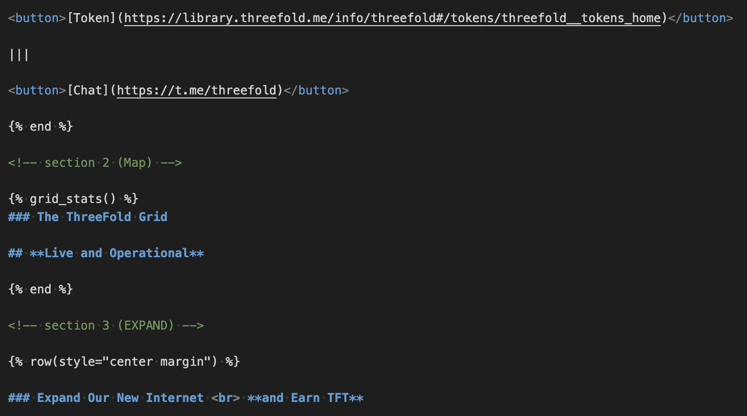
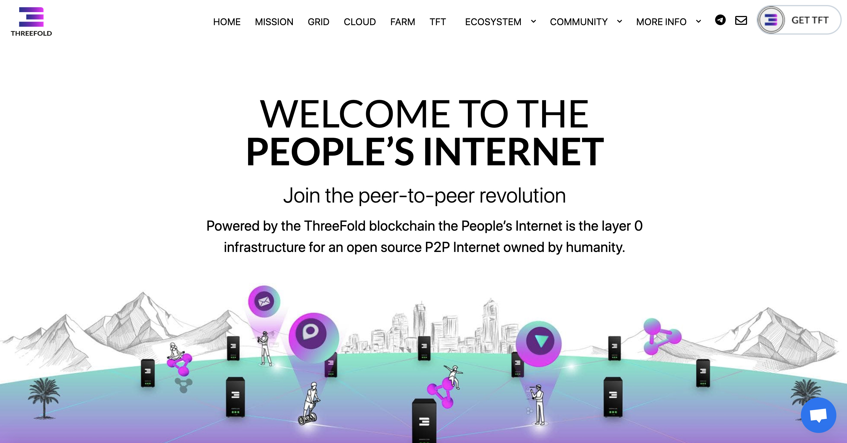
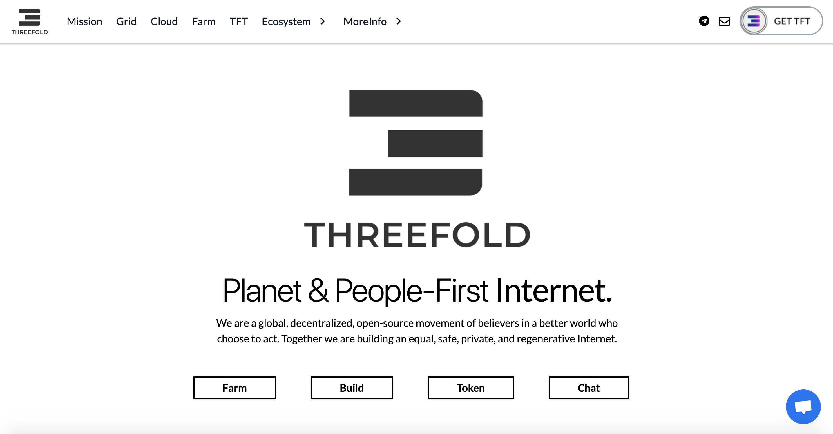
  • I removed all header images. To me they were distracting and doing more harm than good. Instead I added the ThreeFold logo on the home page and on the other pages I left it as white space and added buttons I felt were most relevant.
  • I removed some blocks across most pages to get rid of information that could be viewed as “fluff.”
  • I changed titles from ALL CAPS to Only First Letter because our website shouldn’t be screaming at people
  • The logo on the top-left of the site is updated
  • In the menu, I merged Community into Ecosystem, also I updated links in More Info
  • The footer is updated

So please take a look and let’s decide together: Is this first iteration good enough to go live?

  • Yes, let’s push it live
  • No, let’s keep what we have

0 voters

Let’s make sure we get at least 20 votes and at least 75% approval, otherwise I will hold.

Moving Forward

Beyond your yes or no, I want to hear your feedback. What are some things you would like to see improved on the ThreeFold website? Feel free to leave a reply below or for those who are familiar with GitHub, you can simply create an issue on the ThreeFold website repository and we can discuss it there.

What About the Aesthetics

We are very aware that the current branding and imagery doesn’t cut it. We’re aiming for a more minimalistic approach. Right now the branding update is in-progress but I will share something asap.

3 Likes

Even this one change is fantastic. Bought the whole site up several notches.

2 Likes

I like the black/gray view.

There is one thing that’s still isn’t clear in my opinion.

Is this website also the website for deploying and using the grid?

In that case I would like to see a clear button at the top that says “deploy VM” or “Use Grid”

Right now the first is “Farming”.

But off course if this is the website for providing/farming only it looks good!

Edit:

And it would be really cool if there comes an inverted color where the theme is Black background/white text.

It looks more data like in my opinion.

2 Likes

Thanks, brother. Only up from here!

Appreciate the feedback!

Cloud is more or less the Use / Build section for now. When you click on Cloud you get quick access to the Deploy link. Also on the home page directly you have a button to Build which goes to Cloud. But we could make it even more obvious. I’m open to it.

The all black and white is more an initial step while branding gets re-worked in the background. But we might decide to keep it this way if enough people like it. Agree, we can enable a dark or night mode.

If you agree it’s good enough, by the way, could you vote Yes?

Actually I don’t like Removing all images from headers :frowning:
I like black logo

1 Like

Noted brother! Do you want to see the black logo on the top of each page? I thought it would get repetitive. Or do you want to bring the old headers back?

Keep in mind that it’s just temporary until we have new graphics or a new header concept for each page. Maybe a clean icon could work.

This looks much better. Good stuff! :star_struck:

Just a few quick thoughts.

I’m personally not a big fan of the purple, turquoise color scheme we have for images at all.
I feel like those colors are too flashy/distracting and make the pages feel a bit “childish” (for lack of a better word).

On https://www2.threefold.io/cloud/ for example I would like to see a small description under Quantum safe storage, weblets, planetary network, etc, with smaller icons.

I think we could make the frontpage logo a little smaller on https://www2.threefold.io and put the “deploy on threefold” button more in to the center of attention. I think farmers are much easier to attract and the focus should be more on attracting deployers.

Some live network capacity and usage stats on the front page would be great too.

Right now the frontpage still gives off a very “read the docs” kind of vibe instead of “ready to go now”.

If I imagine landing on threefold as a new comer I would want to see, what are the stats, what do I need to download, how do I get the coin, how do I launch a VM with the fewest clicks?

I think docs, how to build, further technical details like weblets, qfs and terraform are things that don’t need to be as much “in your face” because people looking for that likely already know something about threefold and aren’t as influenced by the vibe of the landing page. Smaller and more discrete links/menu items should do just as well for those.

Other than that. Love all the progress. Great team, great community. Keep on rocking.

2 Likes

No I meant we need to keep images at headers (the old images or looking for new images )
Headers without images wired to me :slight_smile:
For logo I mean the black one is more better than
Pink colour at nav and footer.

1 Like

Is the website hosted on threefold, so we can put Built of Threefold? If we are asking ppl to build on the grid we should show off the things that are already there :slight_smile: Also, the changed slogan is a bit to personal in my opinion. You dont need to be a beliver in better world in order to use the grid, :stuck_out_tongue: I liked more the older one :slight_smile: al rest looks good to go, good job :slight_smile:

3 Likes

This is great feedback, thank you @Rasputin_Rick :pray: To address your points one by one:

I’m personally not a big fan of the purple, turquoise color scheme we have for images at all.
I feel like those colors are too flashy/distracting and make the pages feel a bit “childish” (for lack of a better word).

Totally agree. We’re moving away from those colors.

On https://www2.threefold.io/cloud/ for example I would like to see a small description under Quantum safe storage, weblets, planetary network, etc, with smaller icons.

Agree with this. Will push it in the next iteration.

Some live network capacity and usage stats on the front page would be great too.

Actually, I had placed the Grid Map / Stats as the second block beneath the header but for some reason it’s now showing. Will get that fixed.

If I imagine landing on threefold as a new comer I would want to see, what are the stats, what do I need to download, how do I get the coin, how do I launch a VM with the fewest clicks?

Also agree with this. Will make it more actionable around deploying.

Thanks for the kind words and the clear feedback. This is what it’s all about!

1 Like

Thank you @ehabhassan2 for clarifying. I agree, this is a short term fix.

You know, I don’t know that answer to the first question but I will find out. Agree on the sentiment, though. And I appreciate your feedback on the slogan. That’s very valid. I think we can find something a little softer.

By the way, I saw you voted “no” in the poll about whether or not we should push the new version. I think it’s much better than what we have today, no? Particularly if I make some of the tweaks suggested in the replies here.

1 Like

It is, the “no” was mostly for the new slogan. If that will be softer I will change it to yes now :pray:

1 Like

Alright gang, thanks for the feedback! I’ll be making some adjustments and then we’ll push this bad boy live asap. Then we’ll move to planning and execution of the second iteration!

5 Likes

I would like to give my 2 cents here. I will not give my opinion on the website yet. Firstly I will make some questions, so you guys can “catch” my point here?

In a user point of view (client of the network):

  1. How much time do I have to spend reading to become a client and actually deploy, let’s take as an example, a VPS on the network?
  2. How many steps do I have to take? ( polkadot account, wallet, transfer tokens, swaps, etc)
  3. I think most of us will agree that this is too much complicated for many, many people (like me) and not all IT guys (let’s call them that way) are Crypto savvy. How can this be solved?
  4. Do you think threefold.io should be a farmer oriented website or a more like a selling compute power website just like Linode, Vultr, AWS, Azure, and so on…

I think TF website problem is not the colors, the headlines, etc, but the concept of what is the main purpose of the website.
IMO the website just wants to do everything and does not do nothing particularly well. Wants to attract farmers, wants to share the concept of a free internet, wants to get users. And all of this is “fair”, but not with the same level of priority.

As a farmer, it was a though experience to get things running, but i can accept that - crypto farming(at this level) is for people with some experience or that are willing to learn, but I don’t have the same sentiment about deploying. Deploying something on the “Planetary network”(what a great asset name btw) should be simple, fast and a pleasing experience. Like in all other businesses, clients are the future of this network, so the experience should be as smooth as possible primarily for them.

(sorry for my terrible english)

4 Likes

HI @nooba. I’ll try to give you some pointers with regards to your questions:

  1. The time needed depends on the level of knowledge you have when you start. The ThreeFold grid at this point in time is far from an end-user-ready technology. So reading and learning are required, for everyone. However we have “two experiences” which allows you to deploy in the TF Grid today:

    • Terraform Infrastructure As Code (for developers / experts)
    • Weblets (https://play.grid.tf). Presents a very simple interface for (almost) anyone.
  2. Number of steps:

    • install polkadot browser extension
    • create account
    • install TF Connect app on phone
    • get TFT’s from exchange of DEFI pool
    • load polkadot wallet with TFT’s
    • point browser at https://play.grid.tf
    • deploy

    Please find more detail here: https://library.threefold.me/info/manual/#/getstarted/manual__tfgrid3_getstarted
    So 7 steps. I think all in all those is not too bad.

  3. Please have a look at the https://play.grid.tf. Not too complicated.

  4. Good question, @gosam is leading this. @sam what’s you current thinking.

3 Likes